If you’ve spent five minutes in a campaign training deck, you’ve heard the number: door-to-door canvassing increases turnout by 6% or even higher. It shows up in vendor blog posts, onboarding decks, fundraising pitches. It’s treated as a constant — as if every knock, on every door, in every race, is worth roughly six-tenths of a point of turnout.
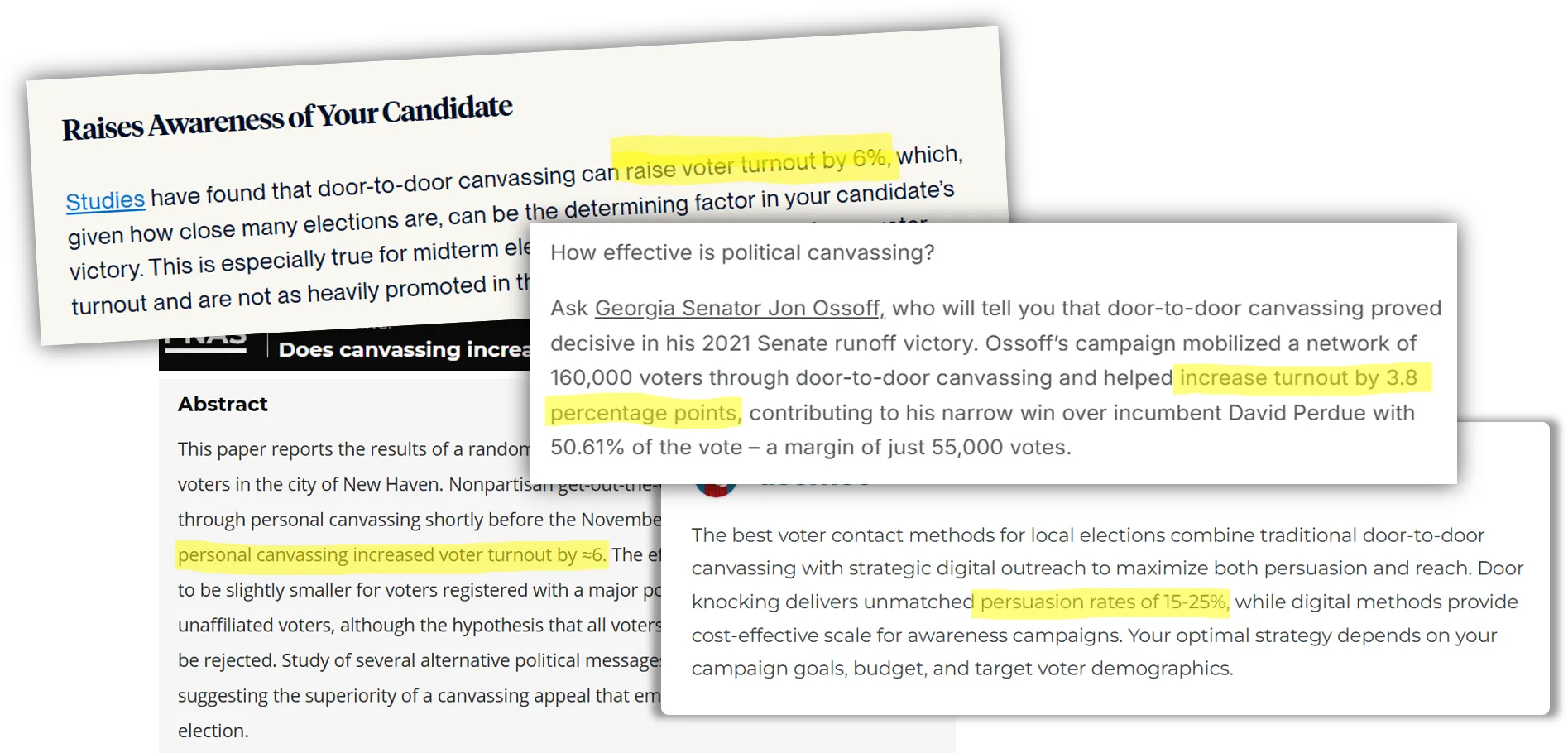
It’s a real number. It’s also being used in a way the study behind it never claimed. And it’s not even the only number in circulation — a canvassing-software vendor’s blog puts the figure at 15–25%. That second number turns out to be a very different, and more telling, kind of problem.
Where “6%” actually comes from
Trace it back and it lands, almost every time, on the same source: Gerber and Green’s 1999 PNAS field experiment in New Haven — one of the founding studies of modern turnout research, and a genuinely well-run one. It’s in our corpus, extracted table by table, and the arithmetic behind “6%” is right there in Table 1.
The study targeted a sample of voters for a personal canvass ahead of a 1998 municipal election. Among everyone targeted — contacted or not — turnout rose 2.25 percentage points. That’s the honest, plan-against-this number: the effect of attempting to canvass a voter, which is what a campaign actually controls.
But only 37.4% of targeted voters were successfully contacted. Divide the 2.25-point effect by that contact rate, and you get the effect among people who actually opened the door: 2.25 ÷ 0.374 ≈ 5.9% — round it, and there’s your 6%. Both numbers are correct. They are not interchangeable. Nearly every popular citation of “canvassing raises turnout by 6%” has quietly swapped the per-contact number in for the per-targeted one — and, going by party registration, the per-contact figure in that same study actually ranged from 4.4% to 8.83% depending on which subgroup you read off the table, which is very likely where the range some of you have seen — “3.8% to 6%,” “4% to 8%” — comes from in the first place.
A number with no study behind it at all
The 15–25% figure is a different animal. It comes from a canvassing-software company and unlike the 6% figure, it doesn’t trace back to anything. The post cites “research from the 2026 municipal election cycle” and “data from 2026 local elections” without ever naming the research, the data, a paper, or an author. Its supporting “real-world case studies” — a city council race decided by 847 votes, 47,000 doors knocked, a 31% contact rate, a candidate who won voters contacted door-to-door at a 64% clip versus 41% for digital-only — name no candidate, no city, and no source, while the post separately promotes the vendor’s own canvassing tool as the thing that (unnamed campaigns) supposedly used to win. Numbers this specific, attached to elections this unidentifiable, are not something we can verify, corroborate, or trace into our corpus — because there’s nothing to trace.
That’s worth sitting with. One inflated number is a real, rigorous study’s best result, stripped of the conditions that produced it. The other is a number that simply appears, formatted to look like it came from research, in a post selling canvassing software. Both get repeated as flat facts about “what door-knocking does.” Neither is something a campaign should plan a budget around.
The real pattern
This is less a story about any one statistic than about a process. A number escapes into circulation — sometimes from a real, careful study; sometimes from nowhere identifiable at all — and it gets used as if it applies to every race, every canvasser, every message, everywhere. The conditions that actually produced it (or that would have to be verified to trust it) get left behind.
So here’s the actual question worth asking: under what conditions does door-knocking approach 6% or more — and under what conditions does it flatline, or go negative? Our corpus, pooled across dozens of studies since 1993, gives a modern baseline of +0.7 percentage points per voter targeted — much closer to Gerber-Green’s own 2.25% ITT figure than to either number everyone quotes. The distance between “0.7” and “6” (never mind “15–25”) is explained by a handful of dials the New Haven study happened to have set in its favor.
Who’s at the door. Paid, professionally managed canvassers pool to +1.6pp; volunteers pool lower, +0.5pp, in a narrower band than the headline suggests — one volunteer program hit ‑3pp.
What’s said. Civic-duty and nonpartisan scripts pool to +1.5pp. Partisan-ID scripts pool to ‑1.7pp — a real sign flip, though the evidence here is thinner than we'd prefer (2 studies).
How well it’s run. 95% of the studies behind these numbers assumed trained, disciplined canvassers. The corpus rates canvassing’s execution-sensitivity as a primary driver of the result, not a footnote — loose execution is where good numbers go to die.
How loud the race is. Low-salience races (local, off-year, primary — like New Haven 1998) pool to +1.2pp; high-salience races (presidential-year) pool to +0.5pp. Not a reversal — the door just carries more relative weight when everything else is quiet.
Stack a favorable answer on all four — paid, well-trained, nonpartisan message, quiet race — and a 5–6% per-contact result isn’t a fluke, it’s close to what you’d expect. Stack an unfavorable answer on any two, and 0% or worse is just as plausible. Gerber-Green wasn’t wrong; it was specific, and verifiable, and still got flattened into a universal constant. The doornoc number never had specifics to flatten — it just arrived pre-flattened. Either way, the fix is the same: ask what conditions produced the number before you plan around it.
A note on the evidence. Figures in this piece are pooled estimates from published field experiments and academic studies in ProgressiveLabs’ tactic corpus, weighted by study design, measurement precision, and how recent the research is. They describe what has been measured, not a guarantee for any specific campaign. Ranges reflect the typical spread of results (25th–75th percentile) across the studies behind each number, not a formal statistical confidence interval; a single outlier study can sit outside that range without changing the pooled estimate. Where a finding rests on very few studies, we say so directly in the text — treat those as early signals, not settled rules. Effects are reported “per voter targeted” (intent-to-treat) unless noted as per-contact, which is a meaningfully larger and different number. This is a living analysis and may update as more research is added to the corpus.